Search This Blog

Tuesday, August 25, 2015

A Touch of the Orient - "Sonchou" - V. Turner Collage

Their is a silent connection between Scandinavia and Oriental cultures. Both love simple lines and uncluttered detail. They also appreciate wood, especially teak. When it comes to art, however, that's a different story. Check out Hokusai and Edvard Munch!

I've always loved the fact that it doesn't take much to suggest either culture - rice paper, bamboo, cranes for the one or fjords, mist, boats for the other.

I find that trying to capture an oriental feeling in art is a peaceful process. Maybe that says a lot for it's appeal for me.

With great respect:
Sonchou - V. Turner


Monday, August 24, 2015

Whatever Happened to the Woman in 34? V.Turner Collage

How does the creative process flow? One piece catches your eye and the rest fall into place.

I start with a background piece then add on top of it.You could also start with a painted background, but at the moment I'm enjoying going through all my treasured paper.

Pieces are then selected and immediately placed on the "base" (I don't lay things out on the canvas or wood panel that will be the final support. Instead, I lay out on a piece of printmaking paper cut the same size as the support. This makes it easy to lay a mat, cut to the same size, on top of the papers to see how it will look without rough or overhanging edges. This way I can lay papers down without tearing or cutting them up until I make the decision of whether or not to use that particular piece.)
Placing things quickly lets the right brain play in a process that could so easily be dominated by the left. I still retain the option of moving pieces around, but a general relationship between pieces gets put down.
Initial layout: colour is off because this was photographed in fluorescent light on my worktable
If I run into difficulty deciding on the choice or placement of the final pieces I start to glue down what I have and wait til these are in place before choosing the final papers. If I don't do that, I have a tendency to start changing everything around! You know how it is - change one stroke or colour and you have to change other things because the relationships have changed. With collage, I make the last changes work with what is already established. I know I can move on to the next collage and arrange things the way I would have re-arranged the prior piece and segue into a series! Cool!

finished piece
A little too much glare on this shot. I'm still not sure about the placement of the three red pieces. I feel the should perhaps be about 3" to the left. 
What do you think?

Sunday, August 23, 2015

"You Can Go - I'm Staying" collage by V. Turner

Collage can allow you to get very personal. It seems to be a natural progression from photo album to scrapbooking to collage. It also lets you choose to get nostalgic and who doesn't love to walk down memory lane from time to time! 

We emigrated from Norway to Canada in the '50's. I was 7. I did not want to go! The thought of leaving everything I knew, especially my grandparents and aunts, uncles, cousins, even boyfriend (yes, that's you Leif-Magne Dalheim!), Torget (the harbour marketplace in Stavanger) and the brown bags full of freshly steamed small shrimp that you ate like peanuts on the bus home, the cobblestone streets, the farm in Klepp, all the little newborn piglets, playing in the fields and getting hungry and reaching down to pull up whatever was growing, dusting it off and eating it right then, 17th of May, the midnight sun, ice cream cake with krokan on my birthday, making marsipan for gift-giving, making heart-shaped baskets to put it in, the ferry ride in Stavanger fjord to get to my grandparents' cottage on Finnoy, going out with my grandfather at 5 am to bring in the fishnets..........

The result: "You Can Go - I'm Staying"

Here is the process:
Pulling together papers, including photocopies of my mother (in the middle) and her family and my grandmother's house, my first report card after we arrived in Canada, a letter and envelope from my grandmother and some other pieces.
start
I don't alter papers ahead of time, although I do make a lot of painted and stained, stamped, silkscreened papers and fabrics. So several pieces had to be "aged" and patinaed. I also auditioned some other papers:

re-arranging and decision-making
The final decision. So many potential arrangements. Photos of the process can help remind me of more possibilities and can lead to a good series.

You Can Go - I'm staying  by V. Turner
Nostalgia appeals to many today. We all long for simpler, more peaceful times. This one sold the day after I made it!

Saturday, August 22, 2015

Collage - A Challenging Artform


I'm back. Life does take some difficult turns and the past two years have been tough. I'm enjoying creating again, but with constraints. Collage. You work within the limits of the materials you choose, especially with regard to texture, colour, line and shape. It's wonderful, and wonderfully frustrating. For an anal retentive/obsessive compulsive person like myself, this forces me to make decisions quickly and to do what is needed to make something work. So far I have 5, and one in collaboration with another artist, S. Pakosh. I find these tremendously gratifying and seriously addictive. When I get settled, I'll take and post pictures of the processes of future pieces as well.

The start:
start


The finished piece:

Cravings
Collage is experiencing an incredible surge in popularity; it resonates with the viewer on so many levels, regardless of the approach, perhaps for several reasons.

  1. Our recycle/upcycle generation loves the idea of items that would ordinarily be discarded finding purpose again.
  2. There is a bit of grittiness due to the fact that edges are torn and some are cut and the piece is glued down. Paper doesn't glue down seamlessly, usually. Bubbles, creases, frayed edges, all attain interest beyond their surface appeal.
  3. Gluing, cutting, tearing all evoke memories of childhood, a time when societal constraints did not dictate our perceptions of our talents; a time when we were brilliant in our own estimations.
  4. Some materials used harken back to a simpler time, with memories of a world that was less stressful.
  5. For all of the above reasons, the mark of the artist is always present, along with, often, a hint of a fingerprint! Collage is not made solely with a brush! It is a tactile process and the viewer is given a front row seat to the hands-on efforts of the artist.
I would love to hear your thoughts on this.

Saturday, January 4, 2014

Calm Before the Storm - Collaged Abstract Painting


I'm under a lot of stress (who isn't these days?) and flying by the seat of my pants the way I do when I paint gets very tiring when you have no idea of where you'll start or what you'll use as far as material, paint, substrate, colour is concerned. I need to work in series, but to do that I need to be in my chair regularly. Right now that's not possible, so I'm going to do up 10 starts, ONLY STARTS, so I have a sense of continuity when I get into the studio.


I can see that I need more discipline. By the time I remembered to take a photo, here is what had happened to my first start - and, no, there are no more starts, but I do have a nice little collage, framed. Aaargh!!!


Next studio day I will do 10 starts..... yup!


Friday, January 3, 2014

Untitled Abstract Process Painting

Unfinished and Untitled
I'm back in the studio, painting, starting to find myself again and it feels wonderful. I don't want to knuckle down to hard work (read "making real serious art") yet so start playing experimenting. This time I've decided to go whole hog: I pull out a sheet of Arches cold press 140 lb! How's that for wanton disregard for cost?!!!


I decide to do a monoprint, starting with black india ink, new drawing sticks I found at Omer Deserres (they're from china - make really nice, intensely black marks when first dipped in water), my trusty Woody, graphite (water-soluble), water, splash around with a lovely cat's tongue brush, throw in some powdered yellow ochre pigment (also a bit of ultramarine in the lower left but it quickly dissipates). This is all put on a taped-down white garbage bag. Everything is beading up - I'm brushing with one hand, paper at the ready in the other hand - flip the paper over and pull the print. I quickly pull the ghost on a sheet of Stonehenge 90 pound. I'll save the ghost for another time.


I'm into a blue phase and working with a lot of chaos, so minimizing my colour palette seems a very wise choice (yeah, I know, I'm lazy) Now it's the fun stuff, mark-making, stamping, drawing, more collage, letting my right brain have free rein in deciding what to keep, what to veil, what to obliterate. Dance with my brush a bit (we needed to get reacquainted). There are a lot of things in here that are becoming precious but I decide I don't have to prove anything by destroying them, so I leave them for now. I can always alter/remove them later if I feel the need to. The powder ocher has left some wonderfully textured areas. They'll be a nice reward to the viewer who moves in for a closer look.
Creating focal areas with nice golden shapes and more agitated line-work, brightening, calming the chaos in inappropriate areas, the number "5" became really important and I like it there. Hmmmm, need to live with it for a while and see what else it needs. I'm feeling the whiter area bottom centre may be a bit distracting, but I really like it (lots of the original monoprinted ink wash still shows there). Maybe I'll move some more light over to the left a bit - hmmmm.

Thursday, January 2, 2014

Painting Abstract Art With Intent

Living on the Edge
It's a challenge to enter the studio and act like you know what you're doing when you haven't pushed paint around for a while. Being a post-war baby means I have a real problem "wasting" material. I decide I'll work on a piece that was an experiment to start with (Sydney and I threw all kinds of acrylics on paper to experiment with their properties. Sydney's into magenta and phthalo green - I'm into muted, greyed down, black, grey). Pulling something out of a piece that two different personalities have worked on is difficult, so I wimped out and decided to experiment further by using this as the basis for overpainting with the intent of altering the existing "stuff", not obliterating it.
I first unified the painting by using gesso veils and washes, leaving some brilliant gems untouched. Then randomly glazing over with warm yellows (transparent yellow and red oxides, quin gold) then picking out some structure using black gesso, brushing, stamping, and collage.

I must have then made the right brain shift because the next thing I remember is looking at the above and thinking, "Oops! I forgot to take photos along the way!" Sorry about that. I'll try to explain. Click on the image and you'll get a better look. I basically started to respond to each decision, letting what was happening guide me to say, "Hey, what if...." so I veiled out the lower part gradually, scraping back, blotting, scratching out, writing into, to make an interesting surface. Then added more collage (upper left, center black), a bit more black gesso painted, black mark-making with Woody, prismacolor, then veiled the top with cerulean blue knocked back with black, greyed out, over-painted darker, blotted, scratched out.

Final touches after walking around with it for a couple of days: warmed up the yellow areas in spots, brought a bit of greyed lavander into the lower white middle to pick up some of the still bright magenta/violet peeking through the mid right and the veiled middle square, brightened the white squares in the black "building" in the middle to make it look painterly rather than just collaged and changed the lower right "window" to eliminate the symmetry in the piece. This work has such a cityscape feel that I added the three little abstract birds in the blue to the left of the black middle.

It has a good feel to it - gritty, decaying, precarious - just the way I like it!

Sunday, December 15, 2013

More on the Subject of Painting the Energy of a World Class City

East End
This city hums with energy. You step out your door and feel it immediately. Your pace picks up, your senses are on high alert and there's eye candy everywhere you look. The architecture, the terrasses, the cafes, the people, the dogs, the storefronts, the traffic - it's constant and pervasive and you bring it back to the studio with you. There's no painting sylvan landscapes or pretty flowers. The brush dances across the canvas and the haunting memory of glimpses of graffiti pervade the imagery.

Wednesday, May 29, 2013

Angst! and The Process of Painting Abstract Paintings

It's been a year and after all the work with polymer, I need to pick up a paintbrush. It's been so long I need to re-acquaint myself with my media and my tools, so I pick up a piece of 65 lb. drawing paper, deciding ahead of time that my painting will be a failure and not wanting to waste good paper! I play and engage in the delightful initial creative dance, with no expectations - just making marks. Before long I'm kicking myself for using "difficult" paper (it does not respond well to water) because I'm liking what's happening. Then I realize that what's happening has the same feel and impact as what I left off with. Now what?!!! I didn't even want to look at the other piece for a whole year! I talk it over with my muse and come to some important realizations/reminders:

  • I have been trying to force myself on these paintings, trying to get them to look a predetermined "way"
  • I have made a decision ahead of time to "say more with less"
  • By choosing inferior materials I have rejected my work before it has even begun
  • The very existence of a work justifies its existence - I don't have to excuse it
  • I have a lot to say and, dag nab it, if I want to blurt it out in one fell swoop, so be it!
  • This is who I am - I don't have to pretend to be anyone else - I am good enough
  • I have been saying "I trust the process" and then been trying to tell the "process" how it should proceed

Interestingly, after this period of agonizing I have a desire to see last year's unfinished piece. I look at it and find it intriguing. I name it "Urban Infrastructure". I can now analyze what I feel is not working and make decisions, one at a time, to bring it to completion.
The feeling of movement is good and the colours work. It is too bland in the light areas when compared to the graphic impact of the dark, so the light areas need to be "grittier". I want the "vortex" in the upper right diminished a lot, but a faint shadow to remain, reminding me of the process. I need to connect some areas since the black is so solid and dominant, appearing as walls in some areas. I use some different "bridging" techniques to accomplish this, including stamping and palette knife.

I'll live with it for a couple of weeks and see if more touches are needed. I already see the white going up to the upper edge on the left needs to be knocked back a bit and I may need to adjust the colour on the upper right edge, but that may be due to photographing this in the evening. I'll take a better picture in daylight and we'll see.

This painting is exactly what I need right now. It will be fodder for at least the next 40 paintings! As this develops, I'll show you what I'll be doing and how you can use your paintings to inspire new work that gives you a cohesive body of work.

Tuesday, June 26, 2012

How to Paint Abstract - 4

I need to add more colour and different colour. Not sure where to go. I'm not feeling on good terms with colour right now, probably gestating new colour relationships! This is such a complex composition I would be better off sticking with minimal colour, but I need to push colour around because the warm yellow/red has become a little too safe. The movement in this painting has been going in from the lower left, up the rung on the left to the circular upper right, down the right, sweeping over to the lower middle and right out of the painting in the lower left. To stop the eye from leaving, I need to deepen the value in the lower left, using light colour to move the eye back up into the middle left so it can start the journey all over again.

Below is the result. Not happy with the colour choice but that can still be modified. I can see that I need to make the lights move a little more prominently up from the lower middle to the middle left.


Saturday, June 16, 2012

How to Paint Abstract Paintings 3

Sometimes it's good to put the images up side by side. This really shows the benefits of taking a picture periodically of a piece you're working on. In looking at the comparison I'm getting ideas for pushing further.


How to Paint Abstract Paintings 2 or "I'm getting a headache!"

STAGE 2
This one is already getting complicated!!! Ok, here goes: The "start" from yesterday began as gestural movement across a sheet of w/c paper with all kinds of drawing media - charcoal, sauce, india ink, graphite sticks, graphite powder, etc. Then water on a flat brush smoothed out some of the charcoal, blended some water soluble graphite, smeared some ink and created various greys. Then, soft pastels were used to play with colour. I didn't like the colours too much (maybe I should invest in some more pastels, lol) but it gave me an idea of not just value contrasts and movement, but warm and cool areas. I love to work with a shallow picture plane, not having too much of a feeling of depth, but I like to weave things throughout the painting, such as lines that travel in front of or behind and reappear. I like to give the eye lots of things to connect and the brain things to puzzle out, so suggestions of words or runes are also in there. The problem I run into at the beginnings of this kind of process is that I like some of the things that happen in the beginning too much, and the dilemma I face is how to continue with the process without losing all the stuff I love in there. This is worst at times when I haven't painted a lot, like this past year with this massive cross-continent move and my myriad of medical "issues" (yeah, yeah, I know, lots of excuses!)

So, I'm forcing myself to dive in, bullying myself into pushing through. After removing as much of the pastels as possible, I still have warm and cool areas, but not so blatant. I'm going to enhance the cool, slowly, working with combinations of cerulean blue, payne's grey and black and white. I can always glaze later to create more variation to the blue, or just paint another layer. Need to strengthen the blacks. Need to work in such a way that peeks of the lovely backgrounds still show through, but need to be brave enough to cover over - not get picky or precious - that's tough!

I've spent an hour on it and have a headache! This one really hurts! Will really have to force myself to work on it daily. This one needs to be done! Gotta get some coffee.

Friday, June 15, 2012

How to paint Abstract Paintings

This time I'll be more honest. Come with me on my journey. I have no idea if this will become a work of art or not. You'll see each step I take. I'll try to explain what my feelings are that cause me to make certain choices. I'll explain my decisions from the standpoint of critiquing - i.e. the critic/juror will talk about the decisions from a design/composition standpoint, but, ultimately, the feelings will win out. Frankly, I don't give a flying fig what the "critic" thinks. If I'm satisfied/happy/gratified/content/pleased, what have you, that's what counts in the end, and I'll tell you why I'm happy with the work, even if it flies in the face of conventional composition! If it doesn't work, I'll try to figure out why. Help me if you choose. Your comments are valued.

Here we go! I haven't painted much over the past year. Lots of excuses - no real justification. Fear, mainly. I've been quite successful. What if I've "lost it"?!! Time to get my butttttt in the chair - actually, I can't paint in a chair - have to be standing up. Need room to move!

So, back to basics. Play with mark-making and gesture - MY gestures.

Here are two starts. The first was so pretty and safe I couldn't do anything to it, so I needed to do more - push the composition beyond "cruciform"; get down and dirty!
The next one pushes composition beyond "safe", but it's difficult not to do what needs to be done to make it "safe"!
 Since the first one is still "precious", I'll work on the second one, the "throw-away". Need to push some colour around so I'll get comfortable working on it. Pastels are wonderful for this. You can eliminate a lot of the colour if you don't like it, or paint on it and the paint will be influenced by the pastels, picking up and blending colour unpredictably.

Continuing to add colour, intensifying some reds, adding complementary turquoise - not so satisfying - some anthraquinone blue, maybe.....
More to come.......get your buttttt in the chair and push some paint around!!!

Friday, March 16, 2012

How to paint Abstract Collage and Mixed Media - The Process of Laden with Shadow

For me the process begins with establishing value contrast using black mark-making graphite, ink, watersoluble crayons, collage elements (newspaper, corrugated paper, grasscloth wallpaper, candy box tissue paper, etc.). This is followed with a tactile process of applying colour using pastels, graphite, powdered pigments, anything that can be applied dry and blended. This is playtime. Gestures are drawn, marks are made and papers are selected by appeal - I go through my stash and pull out what appeals to me at that moment. Put the stash away, otherwise I'll get bogged down with too much choice. I start tearing and cutting and placing papers, not really thinking of anything but the vessel and tying it to the substrate by overlapping paper to emphasize a very shallow picture plane. As the painting progresses, choices with regard to depth and movement in and out of the picture plane can then be altered or reinforced.

Now the process moves into wet (paint, ink, whatever) and I concentrate on negative space. Image 1.


IMAGE 1

At this point I usually need to assert emotions with regard to the content that is developing and gestural linework, drawings, stream-of-consciousness wording become the focus. Image 2.


IMAGE 2

Strengthening  colour choices and partially (or majorly) obliterating recognizable imagery or wordage is next. Image 3.


IMAGE 3

Time for the critic. What works - what doesn't work? Design decisions are made and adjustments follow so the work "reads" well to me and a feeling of completion results. In this piece the right vertical feels too strong and needs to be lessened. Gesso veils accomplish that. The gestural linework on the upper right is too strong and too definite so it needs to be broken up in spots and partly knocked back with veiling. Image 4.


IMAGE 4

Notice how the emphasis (focus) has shifted from the upper left quadrant in image 1 to the upper right quadrant in image 4, and there feels to be a greater feeling of energy because of the diagonal thrust from the lower left to the upper right in the final image.

Thursday, March 15, 2012

Laden with Shadows

A vessel suggests many things merely by its existence - movement, direction, support, purpose, mystery, time, history....... it's been there for quite a while now, but I couldn't see the trees for the woods! The void was always in my work, along with the question of crossing that void - how? safely? when? why? I put my work up around me and looked, and looked, and .... saw! The vessel! Not just a gesture but a "thing"! But I don't paint "things"!!! This "thing" demands to be addressed! I need to study it, from all angles. I recognize it. It is comfortable. It has been with me always. I cannot recall a time when it was absent. It surprises me that I feel so close to it yet so unfamiliar with it, like a part of your body you always have with you but never really notice. I need to spend some time with it and see if it has me figured out! Here is the first conscious approach.

Laden with Shadows

Thursday, September 8, 2011

Hooked on Bottles of Hope

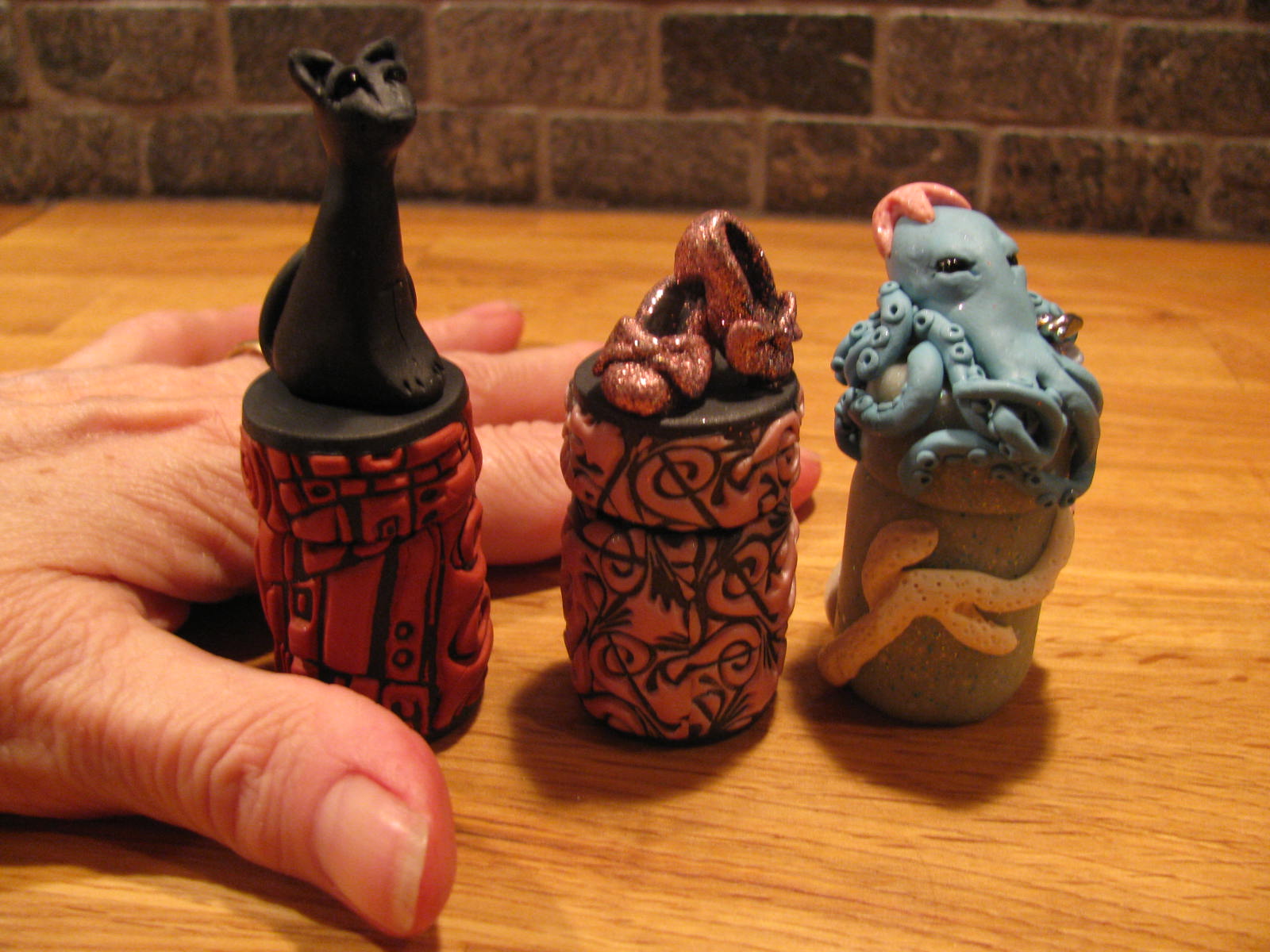
Le Chat Noir by Sandra Mitchell  

Guardian of the Sea by Sandra Mitchell


The Pink Slippers by Vickie Turner

That's it! I'm hooked! These teeny tiny bottles are decorated by polymer clay artists and donated to hospitals to distribute to cancer patients, small messages of encouragement and support tucked inside. They are evidence of compassion and empathy in a world where people are more disconnected and isolated than ever by the techno-crap that clutters their lives - concrete evidence that someone who doesn't even know who the patient is cares enough about what they are going through to spend time, thought and creative energy to show their support and encouragement. So you feel really good making them and giving them, knowing (from reports received back from clinics and hospitals) that these miniature works of art are appreciated and cherished. You start making one, then the muse takes over and you find yourself irresistably pulled to the next little bottle.....then an idea springs up as you are finishing that one and you move to the next .........and onward. They really are addictive to make, wonderful to hold and absorb you as you study their details. What will you do next? A miniature fairy tale scene? Evoke an era rich with visual imagery? Make a statement? Create a creature that protects its holder? So many directions it can take - wait! Maybe clowns! Maybe the circus! Maybe a renaissance jester.......or a knight........or a mermaid...........or........

Monday, February 14, 2011

Down the Rabbit Hole

Have you ever felt that you've lost yourself? Who you've become is not the person you picture in your mind? It's as if you fell down the proverbial rabbit hole and can't figure out how you got there, and worse, how to get back out! I was listening to some great music (well, great to me), the soundtrack from Peter Gunn (ok, so now I'm really dating myself) and the image I had of myself decades ago appeared so clearly and in such detail that I startled myself. I studied her carefully, taking in all the subtle nuances in addition to the obvious details, and then looked at the reality of who I had become - not even close! Do I have to stay trapped in this altered universe? How do I get back to who I really am?

Since "perception is 9/10ths of reality", I have decided to accept my perception of reality as real - I mean really REAL. If I'm colour blind, what do I care if the grass is really green? My reality would say that it's red. Living my life denying my own perception of reality because someone else's perception is more "real" doesn't change the fact that my grass is red, and that red grass is going to show up in anything that I do that is genuine, that is truly who I am. So, what is my reality?
  • No, I'm not 18 any more, but I have the mind of an 18-year-old. 
  • I've lived long enough for life to beat cynicism into me, but in my heart I'm naive and positive. 
  • Time has shown me that people can let me down, but in my mind people live up to what you expect of them, and will respond to kindness with kindness, love with love, patience with patience and honour with honour. 
  • Events have revealed the ineffectiveness and futility of my meager efforts to improve the world, but my perceived reality is that the world should be a better place because a man/woman has lived. 
I've come to envelope myself with mature clothes and embrace black, but that's not me. I see myself wearing high heels, tight pants, leopard print shirt, red and black and arty jewelry. The reality is that I don't feel comfortable in the rabbit hole - it's not a pleasant place for me. I'm depressed here and anxious and see no hope, just further decline and deterioration. I don't want to live there any more. It's time to see the real me again. All right, maybe I won't go buy a pair of 5" stilletto's, but I'm going to keep playing the music that reminds me that I am who I perceive myself to be, and that my perception is vital to recreating my reality.

Friday, February 11, 2011

The Essence of the Creative Soul

Some artists have a way of expressing themselves visually that reaches, unnoticed, into your core and entwines itself gently with your very being. Meet Sandra Mitchell, a woman who's many creative facets always make you look, not once, not twice, but again and again. You sense a connection with her work deep down inside. It doesn't shout, just sings in your very being.

Her latest work, Batgirl, is just such a piece - earthy, evocative, resonant, appealing, yet calling up memories from long ago and places from the long distant past. I just love her. I want her. She is vulnerable, beckoning to be held and cherished like the street urchins from Dickens' day, calling out to be part of your life, moving through your day's activities like a waif hanging close to your heart and enfolded in the warmth of your body. Sighhhhhh.


You can see more of Sandra's work on her Etsy site: http://www.etsy.com/shop/SMitch?ref=top_trail
Do yourself a favour and read her write-ups of her items for sale - they are wonderful.

Monday, February 7, 2011

Claymagination 2011


Claymagination 2011
The first, annual mid-island polymer clay retreat.
Five full days of exploration into the potential of polymer clay as an art medium, including sculpting, surface techniques, mixed media, resin, the new Burlesque Blend and jewelry design and assembly.

The Polymer Claymates Guild is proud to host this event and are pleased to extend an invitation to anyone who would like to attend this art retreat. We have invited three accomplished instructors to teach 5 different classes.

Dates: Tuesday, April 12th, to Saturday, April 16th, 2011

Time: 9am to 5pm daily except Thursday, which will go from 9am to 9pm

Location: Nanoose Bay, precise location to be finalized

Cost: $375 (this fee includes all five days of instruction, all materials needed to complete the specific class projects (tools excepted), a Thursday evening for completing projects, asking additional questions and getting specific help from instructors if necessary, and buffet dinner Saturday night to socialize, celebrate our accomplishments and to give out prizes)

Classes:

Day 1 and 2: Surface Effects – Instructor: Lisa Pakosh


You will be working with a new line of pigment, metal leaf, silkscreening, inserting the clay into premade bezels and learning to work with resin. All clay and materials required for the surface techniques will be provided, as will a bezel blank, bails, necklace chain, headpins, earwires and other incidental finishing materials. Additional bezel blanks (pendants, bracelets, earring and ring) will be available to purchase at cost for those of you who are ambitious and wish to finish more pieces. You will finish at least three pieces.

Day 3: Inside the Box – Instructor: Sandra Mitchell

You will make a themed box with a lid and sitting on legs, if you so choose. This box will be embellished with sculpted elements from a theme that you would select with the instructor’s help. This will include extensive teaching of colour mixing, using a unique technique for developing a coherent colour palette for a particular piece. Also, various inclusions will be introduced for adding texture and interest. Using armature as sculpting foundations will also be taught. Sandra’s goal is to help you to create your own unique characters, whether imaginative or realistic.

Day 4: Burlesque Blends                           Day 5: Urban Grunge meets
                                                                                 Jules Verne
    Instructor: Vickie Turner


Day 4: Burlesque Blends:

This is a new, unique technique that will be taught for the first time in this class. You will also be introduced to working with glitter in conjunction with this technique and designing your piece accordingly. This day will include more work on colour, helping you to choose colour harmonies that yield beautiful results when working with metal clays.


Day 5: Urban Grunge meets Jules Verne:

This class is a combination of industrial chic and steampunk, using the unique “mimic” properties of polymer clay to imitate metal, paper, wood, leather, glass, enamel, rocks and various semi-precious gemstones. We will make several pieces of "found" objects and then use various mixed media to complete a necklace similar to the one pictured above. You will learn some wonderful wire working techniques for attachments and clasps as well. This will be a blast!

Day 5 will end with a buffet dinner and prizes and time to spend admiring everyone’s accomplishments.

Beginner’s/Refresher Polymer Clay Class:

If you are new to polymer clay, or just rusty, don’t fret. A Beginner’s/Refresher class is scheduled for the Friday before the retreat, Friday, April 8th from 10am to 4pm. This class will cover all the basics of working with the clay, handling the tools safely, curing and finishing. The class will be $55, including all the material for the project (tools excepted). However, if you would like to attend the retreat, the cost of this class will come down to $15, to cover just the cost of the material.


We will make a “faux” jade bracelet similar to that pictured above.

Payment can be made via Paypal. $100 non-refundable deposit is required at sign-up with the remainder due by March 10. You can contact me at vickieafca@yahoo.ca